
Liquid Death: How a $700M Water Brand Was Built on Heavy Metal Branding
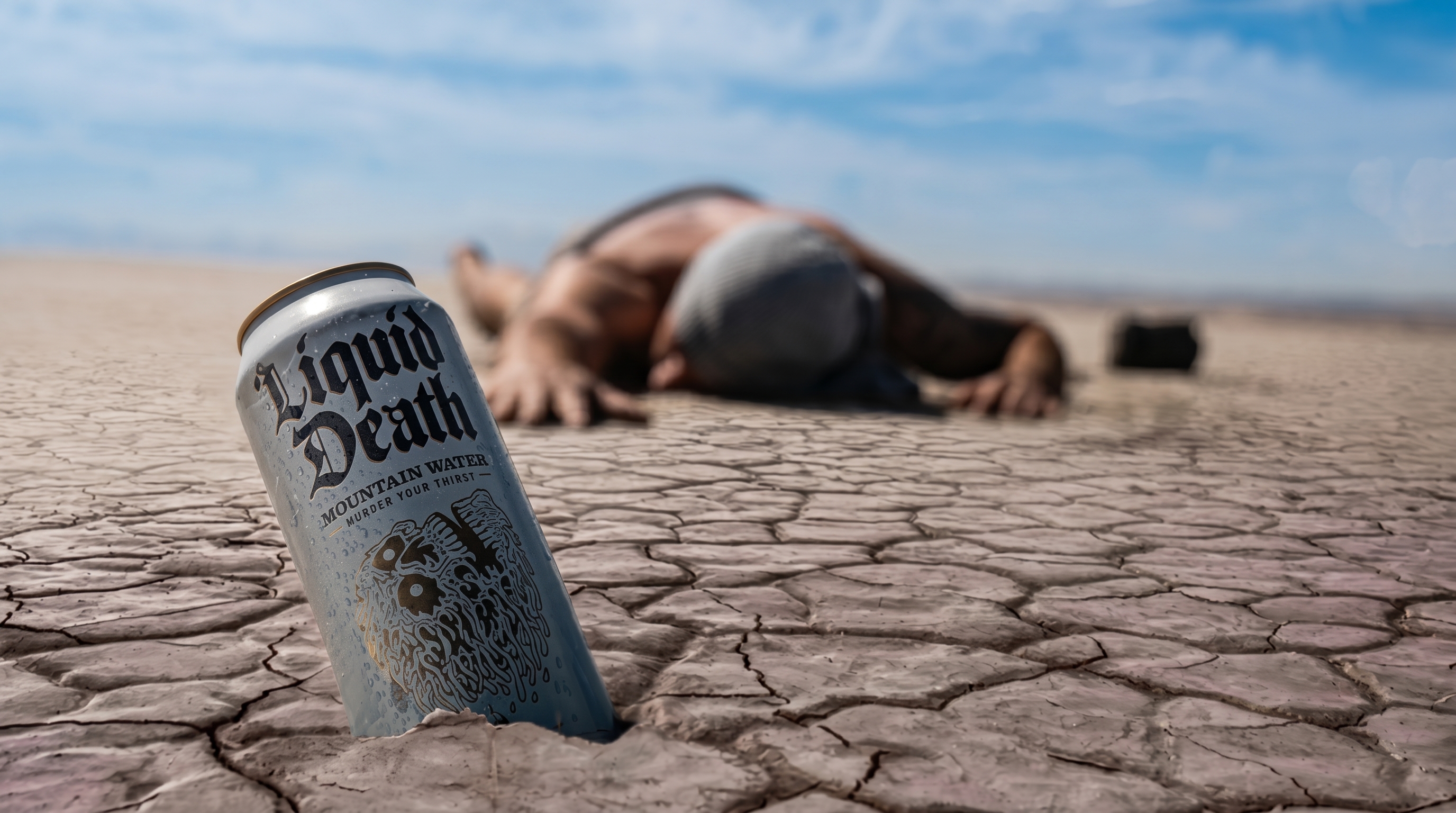
Liquid Death is literally water in a can. The fact that it's a $700 million company is entirely a branding story, and it's one of the more instructive branding stories of the past decade.
Mike Cessario had an idea while watching people at punk and metal concerts carefully peel the labels off their water bottles so they wouldn’t look like they were drinking water. The insight was so specific it sounds made up, but it was real: there was an entire culture of people who were embarrassed to be seen with a bottle of Smartwater at a show. They wanted to be hydrated. They did not want to look like they cared about hydration.
That observation became the entire product brief. Mountain water. Tallboy aluminum can. Skull logo. “Murder Your Thirst.” Liquid Death.
The Context
The American water market by the late 2010s had stratified cleanly along two aesthetic poles. The premium segment was owned by brands like FIJI, Evian, and smartwater, all of which communicated refinement, wellness, and aspirational self-care through blue-and-white minimalism, curved bottles, and imagery of glaciers or artesian springs. The mass market was Dasani and Aquafina in plastic bottles. Neither pole had anything to offer to the person who wanted a drink and also wanted to look cool at a festival.
The energy drink category had long understood that the aesthetics of the can are part of what you’re selling. Monster, Rockstar, and Bang all use aggressive graphic design to signal identity to a specific consumer. But those brands also contain caffeine and stimulants, which creates a functional reason for the design language. Nobody had applied the same logic to plain water.
Cessario’s background was in advertising. He’d worked on campaigns for Netflix and other consumer brands and had a clear understanding of how identity-driven products are positioned. He raised venture capital on the strength of a Facebook page and a few prototype cans before he had a product in market, which says something about the persuasiveness of the positioning story.
Liquid Death launched commercially in 2019. By 2020 it was in Whole Foods. By 2022 revenues had reportedly crossed $130 million. By 2023 the company was valued at approximately $700 million.
The Campaign
There isn’t a single campaign to describe; the brand identity is the marketing. Cessario’s foundational insight was that if the product is genuinely premium in quality and the packaging is unforgettable, then the brand can generate attention through content rather than through traditional advertising spending. Most of Liquid Death’s early marketing was organic social content that looked nothing like a beverage brand’s social media: fake infomercials, horror-movie-style product demos, celebrity appearances (Tony Hawk appeared in a video promoting a limited-run skateboard deck with his blood in the paint, which is exactly the kind of thing you’d expect from this brand), and merchandise that was indistinguishable from actual band merchandise.
The merchandise strategy is worth dwelling on. Liquid Death released hoodies, t-shirts, hats, and accessories that people actually wanted to wear without knowing or caring what the brand was. A Liquid Death hoodie looks like a metal band hoodie. It doesn’t look like branded swag. That distinction meant it circulated in communities without the social cost of visible brand promotion, which is the hardest marketing problem in subcultural spaces.
The brand also leaned into its environmental positioning as a secondary narrative. Aluminum cans have a substantially higher recycling rate than plastic bottles, and Liquid Death partnered with environmental nonprofits and used sustainability messaging in select retail environments. This wasn’t the primary brand story, but it gave Whole Foods and other eco-aligned retailers a reason to stock it that had nothing to do with skull logos.
Distribution at major concert venues became a cornerstone of the strategy. At festivals and shows, the plastic bottle ban meant that alcohol-free options were limited to bottles from venue vendors. Liquid Death’s can format put it on the same footing as beer and hard seltzer on the beverage cart, which was precisely the point. The person who didn’t want to drink alcohol could now hold a can that looked like they might be.
Why It Worked
Counter-positioning works when you find an audience that isn’t just underserved by the category’s incumbents but is actively alienated by them. Liquid Death didn’t just offer an alternative to minimalist wellness water; it offered a rejection of the entire aesthetic category. That rejection is more motivating than mere preference. Consumers don’t just choose Liquid Death; in their cultural context, they’re choosing against something.
The second reason it worked is that the product actually functions well in its core environment. This is easy to overlook in a branding case study. Tallboy cans are standard at every concert and festival. They’re durable, they chill effectively, they’re accepted at the bar, and they sit in a cup holder without falling over. The can isn’t just aesthetically correct; it’s operationally correct for the venues where the brand was built. The product design and the brand positioning are solving the same problem simultaneously.
The third factor is restraint. The humor in Liquid Death’s content is specific and consistent. It doesn’t try to appeal to everyone. It doesn’t try to be edgy in generic ways. It stays within a narrow tonal range, death metal aesthetics and irreverent absurdism, that is genuinely coherent with the brand’s visual identity. That restraint is harder to maintain than it looks, especially as a brand grows and investors push for broader audience appeal.
The Results
By any measure, Liquid Death’s growth trajectory is remarkable for a product that is, literally, water. The $700 million valuation reflects investor belief that the brand can sustain premium pricing and distribution expansion through the same identity-driven positioning that built the original audience. Revenue growth from $3 million in 2020 to over $130 million by 2022 is a trajectory that most consumer goods companies never see.
The retail distribution tells a complementary story. Whole Foods gives the brand premium health-food credibility. Target gives it mass market scale. 7-Eleven gives it impulse-purchase reach. Concert venues give it its cultural home. Each channel serves a different consumer need without requiring the brand to change its identity. That flexibility is a function of the positioning: “cool water for people who think wellness branding is embarrassing” resonates across a wider demographic than it might initially seem.
The celebrity and cultural partnerships extended the brand in expected and unexpected directions. Collaborations with Steve-O, Tony Hawk, and various musicians grounded the brand in real subcultural credibility. Limited merchandise drops maintained scarcity and desirability in the way streetwear brands do. The brand behaved more like a record label than a beverage company, which is why it succeeded with an audience that mostly ignores beverage marketing.
The Lesson for Today’s Marketers
Liquid Death’s story is not really about water. It’s about the difference between positioning against competitors and positioning against an entire aesthetic category.
Most challenger brands try to be a better version of the existing leader: cleaner, cheaper, faster, more effective. That’s a legitimate strategy with a clear playbook. Liquid Death did something harder and potentially more durable: they identified an audience that was specifically repelled by what every existing player was doing, and they built a product experience that validated that repulsion.
The question Cessario was effectively answering wasn’t “what do people want in a water brand?” It was “what audience is the entire water category ignoring, and what would they actually buy?” The answer was: people in music and festival culture who found wellness aesthetics alienating and didn’t have an option that felt like it was made for them.
Before you try to build a better version of what already exists in your category, it’s worth asking whether there’s an audience that doesn’t want a better version of what exists at all. Sometimes the best strategic position is a complete rejection of the category’s assumptions, as long as the product is actually good enough to back it up.
Key Results
- Valuation: Liquid Death reached a valuation of approximately $700 million as of 2023, making it one of the most valuable independent beverage startups in the US
- Retail Distribution: Liquid Death secured shelf space at Whole Foods, Target, 7-Eleven, and major concert venues — distribution that most challenger beverage brands take a decade to achieve
- Social Following: The brand built over 1 million Instagram followers and hundreds of thousands of TikTok followers largely through organic content before major advertising spend
- Revenue Growth: Liquid Death reported revenues growing from roughly $3 million in 2020 to over $130 million by 2022, a growth trajectory that attracted significant venture and private equity interest
SWOT Analysis
| Strengths | Weaknesses | Opportunities | Threats |
|---|---|---|---|
|
|
|
|
Key Takeaway
Liquid Death proves that counter-positioning works when you identify an audience that is actively repelled by the category's dominant aesthetic — then give them the product they wanted to carry all along.
Related Case Studies
Frameworks At Play in This Campaign
This case study demonstrates these marketing frameworks in action: